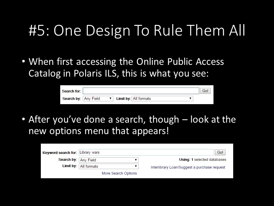
But there isn't even consistency across the desktop versions of Polaris, either. When you first click into the catalog, the search box here has a set of possible options and limiters to use to try and narrow down your search query right from the beginning. That's a great idea to have available right from the start.
...but then when you've actually searched for something in the catalog, new options appear on the results page, options that could have been integrated into the original search page, like the full set of possible options and limiters available to search by and the option to search something as a possible Interlibrary Loan. Many a time have I been frustrated by having to search for something first, and then be able to go back and tailor my query to the exact specifications that I was looking for. I could go straight to the one with the options by clicking on "search catalog" and then clicking on "keyword", but I'd really rather just have the first search box I'm presented with be one that has all the useful options available. (I can understand hiding Interlibrary Loan, since those take longer and get handled differently than in-system requests). There's a lot of duplication and messiness that could probably be cleaned up or folded into one interface, so that the people who have to maintain and develop for that interface only have to keep track of one thing and test it vigorously. This seems like a winning option. It is more difficult than one might think, though, with the proliferation of devices of various sizes, pixel depths, and resolutions, but following the principles of Universal web design in program and app design will probably net some useful improvements - or even avoiding certain pitfalls entirely. Which makes happy users.
And happy users are what you want to have.